
Crypto has spent a decade getting shinier. It still hasn’t gotten understandable.

One evening I walked past my dad in the living room and did a double take. He was hunched over his laptop, as usual, but instead of reading the news he had a small AI factory running: generating images in ChatGPT, a Lovable tab open to draft a website, Claude wiring the whole thing together.
This is my sixty‑five‑year‑old, recently retired father. A sharp diplomat his whole career, but never a “tech person.” If you would have asked him last year, he couldn’t have told you what HTML was. Now he was building an entire website for his side project by himself, describing what he wanted out loud and letting a set of AIs handle the plumbing.
That scene has been stuck in my head because it forces a hard question: why did AI manage to onboard my dad all by itself, while crypto still can’t? No tutorial, no walkthrough, no daughter on the phone. He had a goal, AI’s interface met him where he was, and it just worked. Crypto has had ten years more runway and has never produced that kind of moment for him.
This piece is about that gap: why crypto still can’t safely onboard someone like my dad, and what would have to change, screen by screen, for that to be possible.
It’s not because crypto lacks a wow factor. We wouldn’t be building here if we didn’t believe in the upside. The problem shows up in a much more basic test I keep failing. Even though I’ve worked in crypto for years, I still cannot, in good conscience, walk my dad through a simple, real‑money flow: install a non‑custodial wallet, receive some tokens, and off‑ramp them to his bank.
I don’t trust the UX to keep him safe. Not yet.
I can picture it too clearly: he signs or approves the wrong thing, pastes the wrong address, picks the wrong chain. One confident blue button between him and an irreversible mistake. And that is the whole reason I’m writing this.
Over time, we’ve gotten very good at making dapps look like modern fintech. Smooth gradients, rounded corners, latency hidden behind spinners. They borrow the aesthetics of Revolut and Robinhood: clean, calm, reassuring. What they don’t do is make themselves intelligible. They don’t tell a reasonable Joe what is about to happen to their money at the exact moment they authorize it. The polish is a promise the product can’t keep.
What follows are seven real examples from products I’ve used in the last month. None of them are edge cases. They are all well‑funded, widely used dapps. And each one fails a normal person at the moment of action.
When “connect wallet” doesn’t actually connect your money
Liquid is a trading app. You click “Login,” connect your wallet and you are in. So far, so familiar.
Then you try to trade and learn that the wallet you just connected isn’t actually the one trading. The app has silently created a second wallet for you, an embedded Privy account, and all activity happens from there. To fund it, you copy a 42‑character address and manually send USDC from the wallet you just connected.
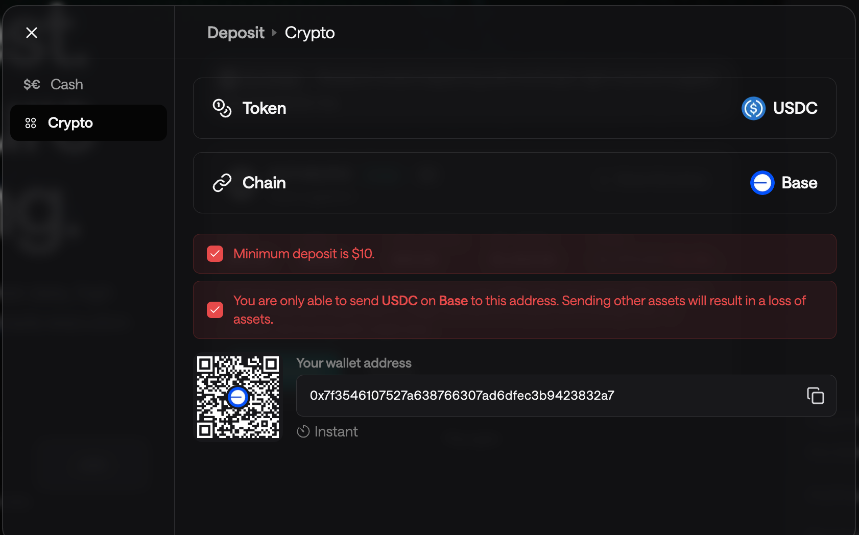
Sit with that for a second. You connect a wallet precisely so the product can see and move funds on your behalf. Liquid responds by shifting the riskiest step back to you: a manual transfer to a fresh address. And the stakes are spelled out in red: minimum $10, USDC on Base only; send any other asset, or the right asset on the wrong chain, and it’s gone.
The interface has enumerated every way you can lose money here. Its safety mechanism is to color the warnings red and let you proceed anyway. That’s not a guardrail. It’s a sign pointing at the cliff.
The fix lives one step earlier in the flow. You already have my wallet connected so why not allow me to fund the embedded account from there in a single, validated transfer or even better: let me use my connected wallet by upgrading it to a smart wallet?
When one big yield number hides what it’s made of
Morpho is a yield vault platform. You deposit into a vault curated by a team like Gauntlet or Steakhouse; they put the funds to work, you collect interest.
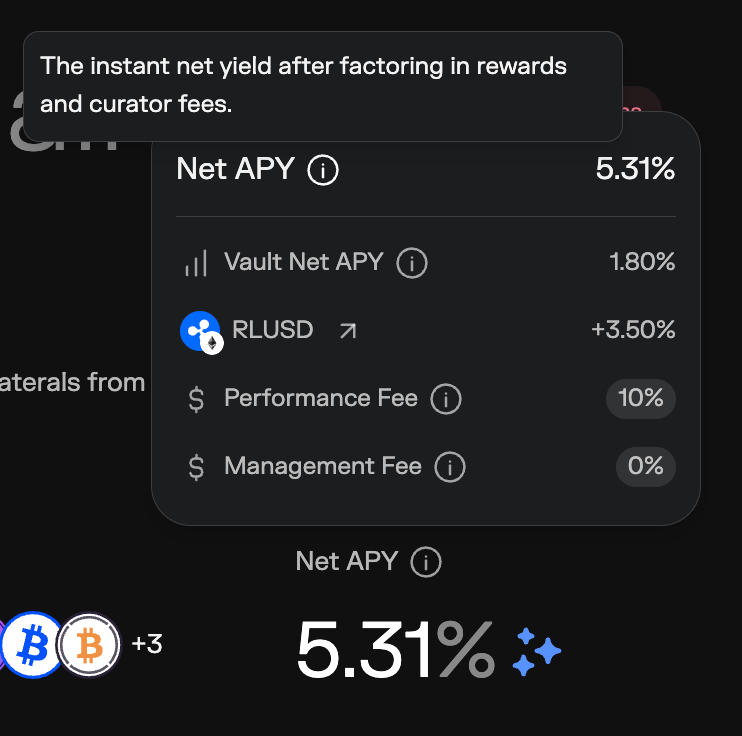
Front and center sits a big, attractive number: Net APY 5.31%. It’s sparkly, it’s large, it’s the number you’d screenshot and send to a friend. And it’s not actually what you earn in the way you think you earn it.
If you crack open the small disclosure toggle above it (the one almost no one clicks, because the headline already looks good) the 5.31% decomposes. Only 1.80% is the vault’s actual yield in the asset you deposited, compounding automatically. The remaining +3.50% is in RLUSD, a separate reward token you receive only if you remember to claim it; it doesn’t quietly appear in your underlying balance.
Those two components behave nothing alike. The base yield is:
in your original asset
automatic
as predictable as the strategy allows
The reward half is:
in a different token whose price moves
funded by a program that can change or end
contingent on a manual claim the UI never asks you to make
I understand the competitive pressure. Vaults are compared on a single visible APY, and 5.31% will attract more deposits than 1.80%. Compete on the number if you must. But legibility is not the thing you get to sacrifice in that race.
Show the composition by default, not behind a disclosure triangle. Label each part in plain language: this portion, your asset, automatic; this portion, RLUSD, variable, and only yours if you claim it.
When users ask “what happens?” and you answer with protocol lore
Maple is a lending protocol. When you click ‘Unstake SYRUP’ in their dapp, you really have one question: if I do this, what happens to my money and my rewards? Maple’s on‑screen answer is:
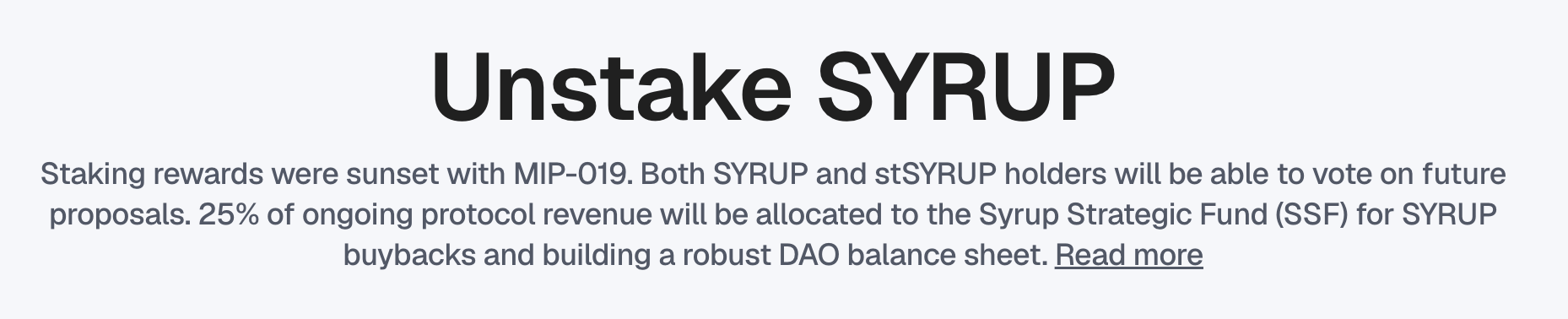
Three short sentences, nine bits of jargon, and not a single direct statement about what happens to your balance.
The copy is written about what the protocol does with its revenue and its governance structure. It answers Maple’s internal roadmap question, not the user’s money question, at the precise moment the user is deciding whether to unstake.
This is the purest version of a pattern all over crypto: copy written by insiders, for insiders, shipped to everyone else. And it’s not primarily a writing problem; it’s an empathy problem.
When getting back my money turns into a scavenger hunt
mETH Protocol is a liquid‑staking app on the Mantle network. You deposit ETH, receive a token that earns staking rewards, and at some point you want your ETH back.
When I tried to redeem, “get my ETH back” turned into a multi‑day relay race. Because cmETH, the restaked token, is being deprecated, my path looked like this:
bridge cmETH from Mantle to Ethereum
wait a couple of hours
come back and confirm the bridge
swap cmETH into mETH
request a claim
wait again
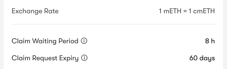
The UI mentions two key numbers, in small text: a Claim Waiting Period of 8 hours and a Claim Request Expiry of 60 days.
That second number is brutal. It’s a hidden deadline on your own funds. Start the withdrawal, get busy for two months, and the claim can simply expire. The protocol keeps moving; your money quietly becomes unclaimable.
Nowhere does the app show the journey as a whole: how many steps there are, how long they take, which one you’re on, what happens if you stop midway. There are no notifications to bring you back at the right time. I left the tab open and kept checking in, manually tracking a sequence the product should have owned.
I expressed one intention (unstake my ETH) and the protocol responded with a scavenger hunt.
In any sane UX, a withdrawal is a single stateful flow the product owns. The interface should lay out the full path and honest total time upfront, track progress, ping you when the eight hours are up, and shout if a claim is about to expire. The user shouldn’t have to be the conductor holding the whole cross‑chain sequence in their head.
When you ask for consent without explaining the change
This one hurts because it’s related to Coinbase, the most resourced, consumer‑focused player in the space, publicly committed to bringing the next billion people onchain.
When Coinbase Wallet was folded into the Base app, the migration was already jarring. There’s now a “Base mode” toggle you have to decode by feel. Then I tried the most basic crypto action: swap some ETH on Base for USDC on Base. Same chain, no bridging, nothing exotic.
Instead of a straightforward confirmation, I got a modal:
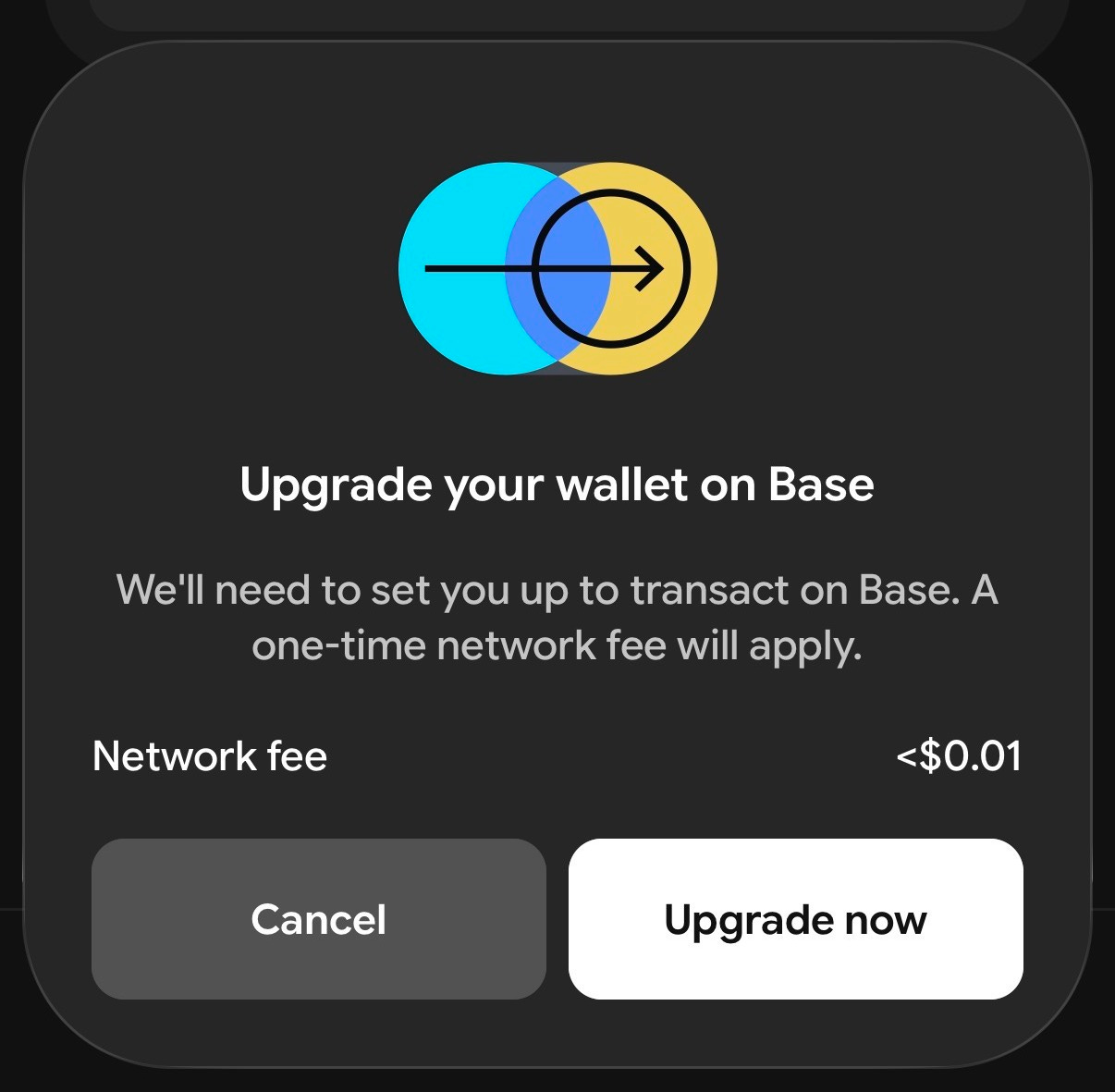
“Upgrade your wallet on Base. We’ll need to set you up to transact on Base. A one‑time network fee will apply.” With two options: Cancel or a bright “Upgrade now.”
Upgrade to what, exactly? The copy doesn’t say. I can hazard an educated guess that this deploys some form of smart account. But I work in this industry. A normal person has no chance and crucially, there is no escape hatch. No “What is this?” link, no FAQ, no short explanation.
You’re being asked to authorize a structural change to how your wallet works, at the moment you’re just trying to make a tiny swap. The fee is under one cent, so this isn’t really about cost. It’s about asking the user to consent blindly.
If you’re going to change how someone’s wallet behaves, you owe them one clear sentence about what is changing and why it’s good for them. “We’re upgrading your wallet to a smart account so transactions are safer and easier to recover,” followed by a link for the curious, would already be a different world.
If the company chasing the next billion people can’t explain a sub‑cent operation to the human taking it in plain English, those billion people are not coming.
When “unsupported” looks exactly like “your money is gone”
Rainbow and Zerion are both crypto wallets. You connect the same address to both. They both promise to show you “what you own.”
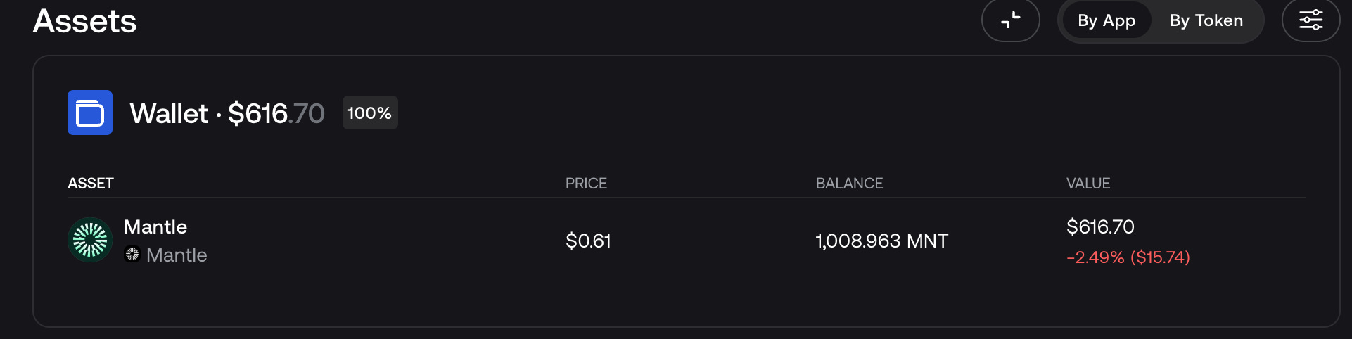
Rainbow told me I had no MNT at all. Zerion, reading the same account, showed $616.70 on Mantle. The funds never moved; Rainbow just doesn’t support Mantle, so it rendered six hundred dollars as empty space.
That’s the horror: Rainbow turned “we don’t index this network” into “you have nothing.” And to any normal user, a blank where there should be money reads as gone. Theft and “unsupported chain” are visually indistinguishable until you happen to plug your wallet into a different app.
Not supporting every chain is totally reasonable. No one does. But concealing that absence behind a proud “$0” and a tidy little “100%” allocation is not.
If you don’t see a network, say that explicitly. “We don’t yet support Mantle; balances there won’t show up here.” Make adding a new chain a guided, human step, not an RPC incantation that only power users can perform.
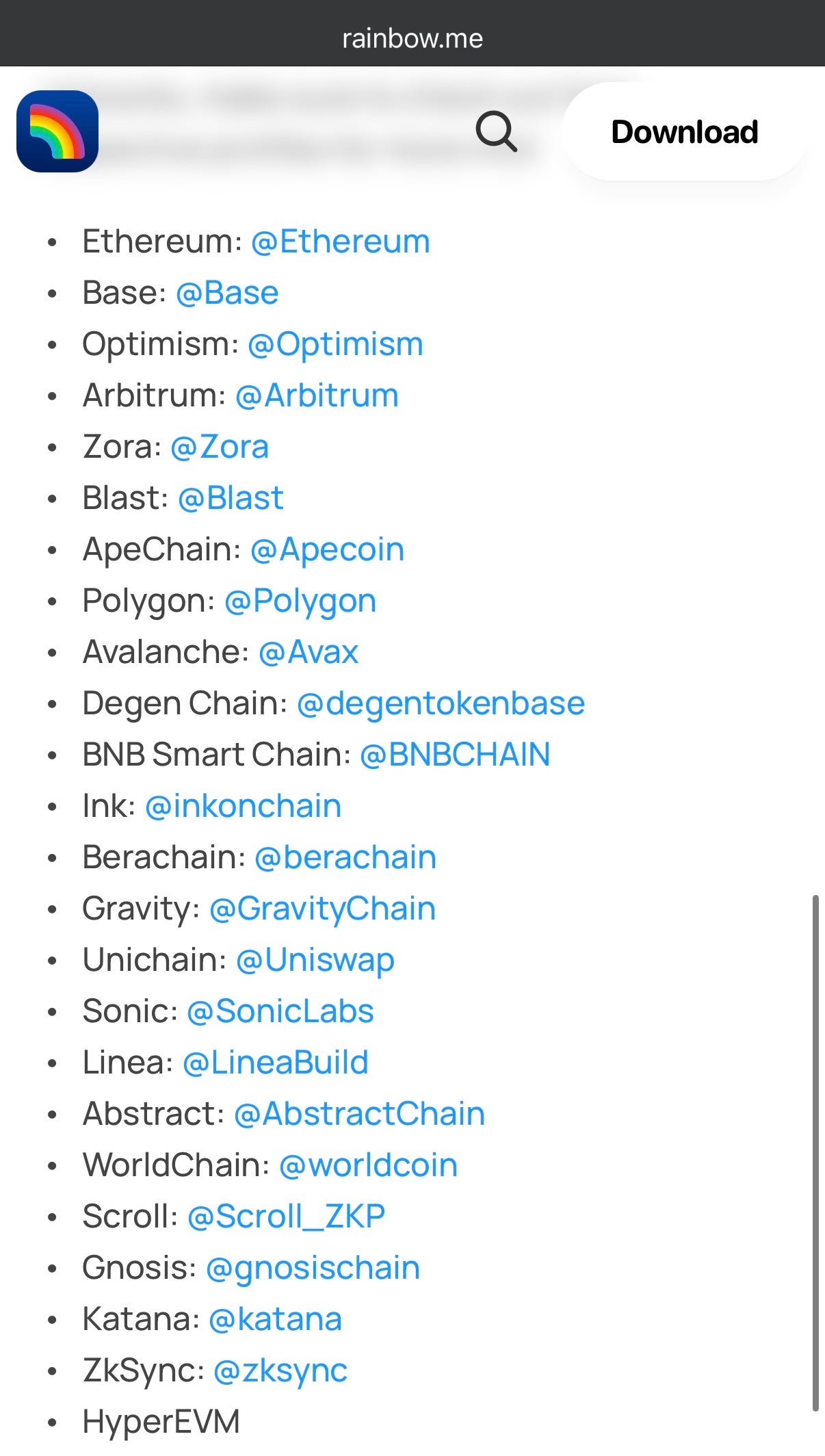
A wallet has one sacred job: tell the truth about one’s holdings, including the parts it can’t see. Unsupported must never be rendered as zero. A total that quietly omits entire networks the user doesn’t know you’re ignoring isn’t a balance.
When the very first decision is already ambiguous
Ondo Finance is a platform for tokenized real-world assets (e.g. US Treasury bills wrapped onchain).
When you land on their homepage, you’re greeted by two primary buttons, side by side, equal weight: Connect Wallet and Sign Up/Log In.

A new user arrives with a simple intent: get into the app. Now they’re staring at two doors with no labels. Are these synonyms? Two separate accounts? Is one for wallets and one for email? Which comes first?
This isn’t just Ondo. Half the industry ships a variation of this fork.
Look at how much jargon we’ve already asked newcomers to juggle. They’ve barely learned that “sign” and “approve” are two different transaction types with wildly different stakes, despite both being presented as a single tap. Now, before they’ve even entered the product, they have to distinguish between “connect wallet” and “log in with wallet”, phrases that sound interchangeable, behave differently in each app, and rarely explain themselves.
The pattern underneath all of this
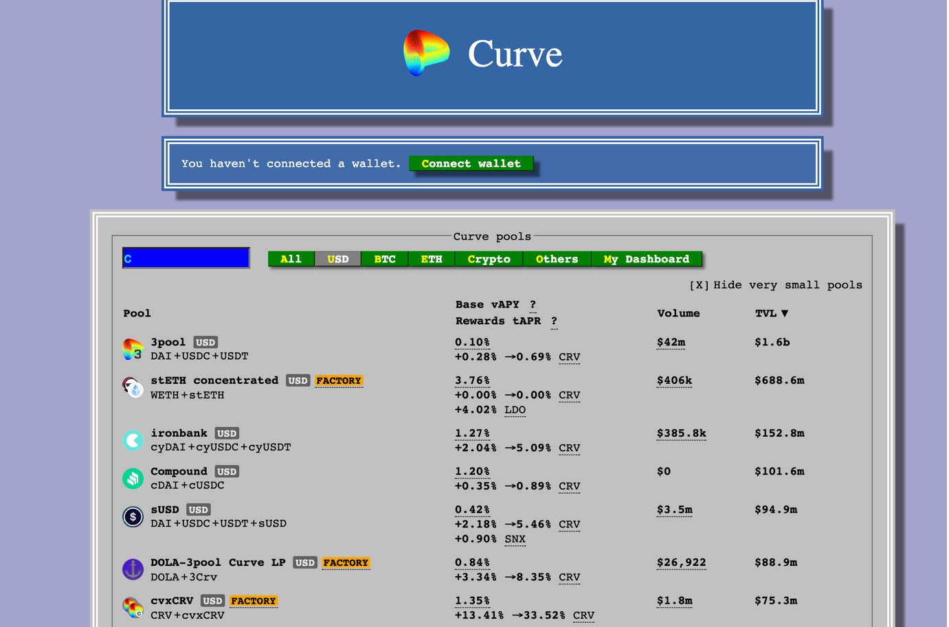
Years ago, I asked another founder building one of the main Cosmos wallets how you know you are a true crypto degen.
“If you can navigate Curve,” he said.
At the time, Curve’s site looked like a 1990s terminal emulator. It was so intimidating that it was hard to believe real money was moving through it. Today Curve is far more polished, and so is much of DeFi. But the rough edges were never the core issue.
A few months back, someone on r/defi sub-reddit asked the real question behind this entire essay:

The best reply in the thread nailed it in two lines:
“It has improved for existing users, but I do not think it has crossed the line into normal-person friendly yet. A lot of the progress has been infrastructure maturity disguised as UX progress.”
That’s the trap. Most of what we celebrate as UX wins are really infrastructure wins in a UX costume. Faster execution, better routing, more battle‑tested contracts, cheaper gas, smoother settlement. All valuable. Almost all aimed at people who already speak the language.
Meanwhile, the failures that keep my dad out, complicated lingo, understanding what a transaction actually does, and recovering when something breaks have barely budged.
And as that commenter pointed out, if a user can still lose funds forever because they signed the wrong thing or misplaced one phrase, the experience is structurally fragile no matter how pretty the interface is.
Taken together, the seven examples above are not seven isolated complaints. They’re one pattern:
Crypto optimizes for how trustworthy a product looks instead of how comprehensible it is.
In a system where most actions are irreversible and denominated in real money, comprehension is not a nice‑to‑have on top of safety. It is the safety.
For everyone building wallets, exchanges, bridges, and vaults: assume the person on the other side is smart, busy, and cannot afford to lose money. And build so that what happens to their funds is unmistakably clear at the exact moment it matters.
AI, somehow, managed to clear that bar for my dad in a single afternoon. We’ve had a decade.
In many ways, this is exactly why we’re building CoinFello. If crypto UX keeps optimizing for insiders, my dad will never make it past “connect wallet” without me hovering over his shoulder. Our bet is that an agent like Fello can flip that script: you describe what you want in plain language, and Fello does the hard work of researching, verifying smart contracts, and finding the right route or yield—while you are in control at every step. I want him to feel the wow moment too in crypto. The day my dad can safely chat with Fello and move money onchain as easily as he talks to ChatGPT or Claude is the day this whole space finally feels ready for normal people.